BLVD UI Design System
Building BLVD UI, Boulevard's design system for Boulevard Dashboard.
When
- 2020 – 2021
Platform
- Web
Expertise
- Design Systems Design
- UX/UI Design
- Front-End Development
Tools and Tech
- Figma
- React
- Storybook
Background
Boulevard is a business management platform for appointment-based businesses. It handles scheduling, point-of-sale, and e-commerce for services and goods in one product.
My Role
I led the research, design, and implementation of BLVD UI, and built the component-driven process that connected it to how product, design, and engineering actually shipped work.
The Challenge
Untangling years of unguided UI growth and building a design system that could carry the product forward without breaking what already shipped.
Visual debt
Years without designer oversight left quality gaps and inconsistencies across the UI.
Inherited Material UI
The existing design system was Material UI, with little original code and no original documentation.
Wrong fit for dense UI
Material UI's principles didn't match the demands of a dense enterprise dashboard.
Two frameworks, one system
The system had to serve both new React code and legacy Angular code without forking.
UI Inventory
I started by building a screenshot repository of every color and recurring UI element in the app. After working through the product end to end, I grouped those elements to see what the system was actually made of.
Research
I needed to understand the process, design, and technical obstacles before I could plan around them. The product design and engineering team was small, so I interviewed engineers directly to surface pain points and prioritize early.
The questions guiding that research:
Stakeholder commitment
Is there full support across product, design, engineering, and executive for untangling the current design and building a system from scratch?
Systems literacy
How well-versed are design and engineering in design systems and systems thinking?
Process entry points
At what point in the design and development process will design system input be required?
Integration path
How will the new system blend with the existing UI without forcing a big-bang rewrite?
Insights
Team
Process
Design System
Foundations
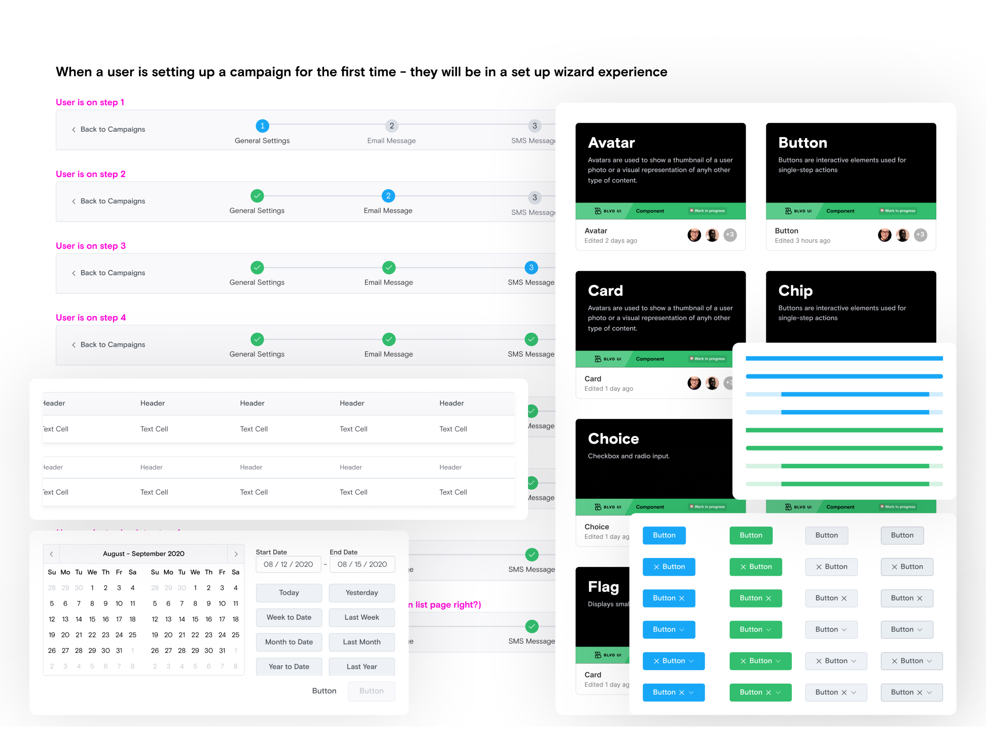
We started with design tokens. Components would take longer to build, but tokens were something engineers could apply directly in the app right away to start pulling the UI toward the new system.
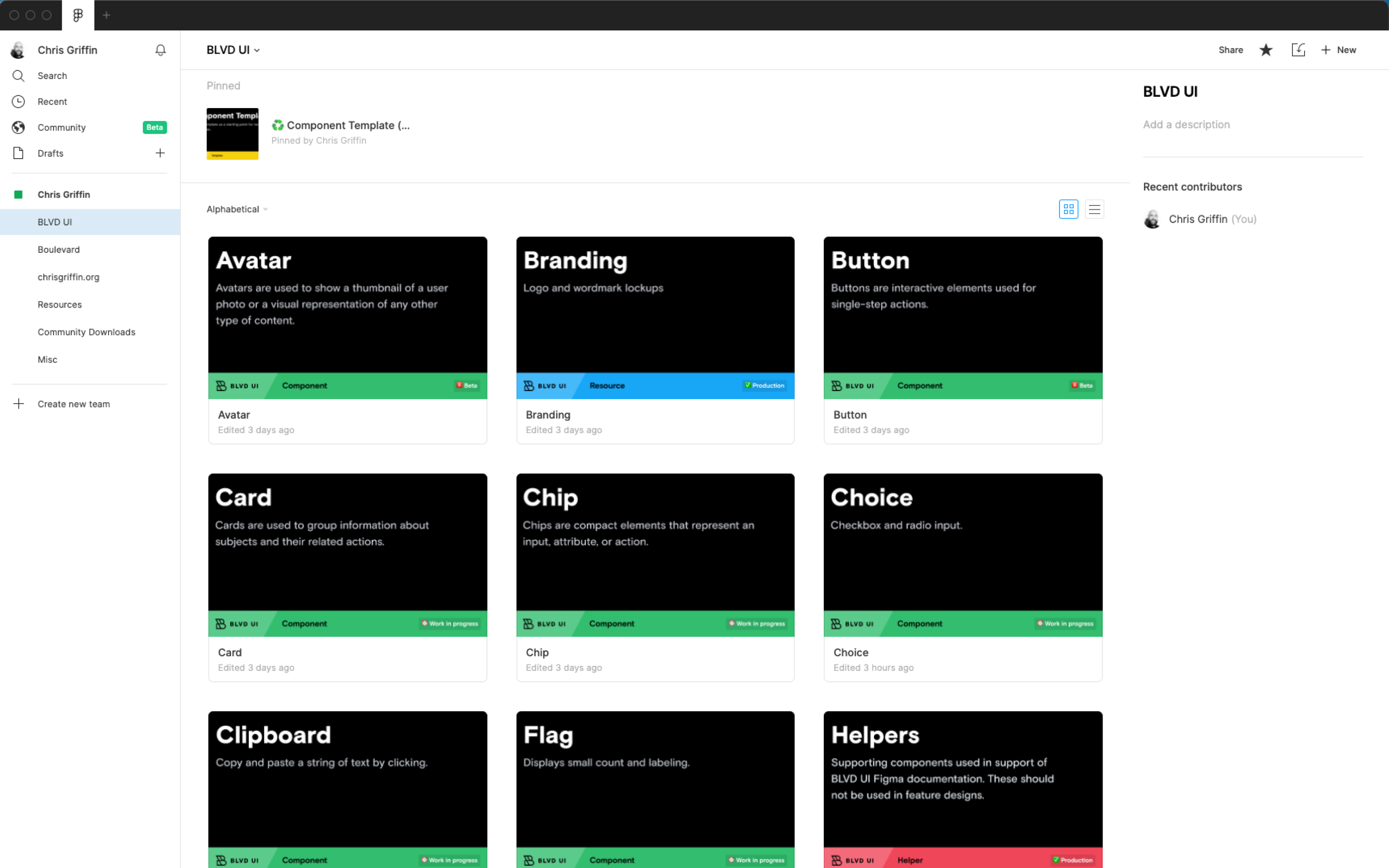
Components & Storybook
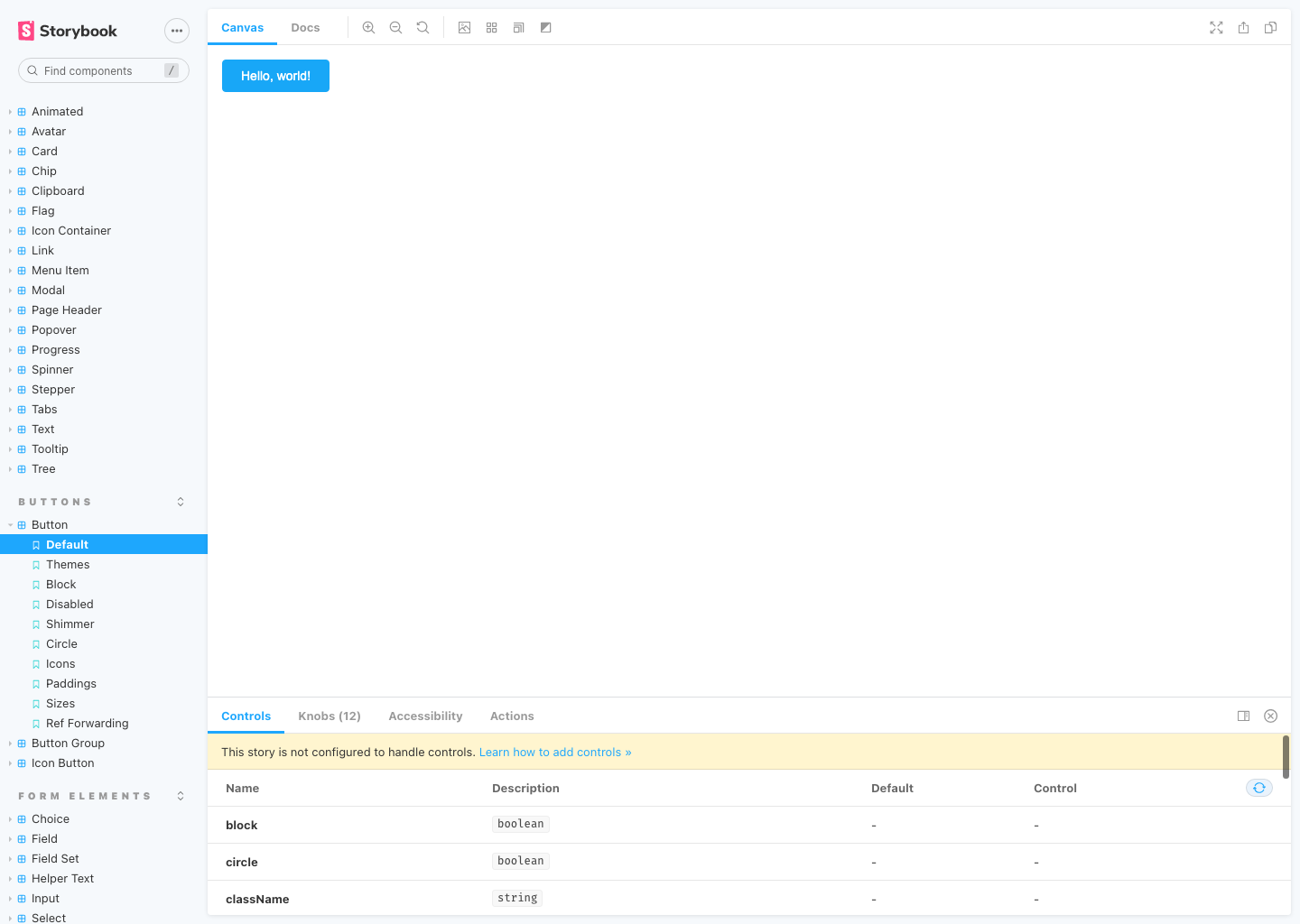
Atomic components like buttons, form elements, icons, and text were built on top of the tokens so every design decision traced back to the foundations.
To keep designers and engineers pointed at the same source of truth, each Figma component shipped with variants that mirrored its React API. I used the same terminology in Figma and code wherever possible, so a designer's prop name was the engineer's prop name.
Storybook hosted every component and its variations. It doubled as the development sandbox and the place we ran interaction and basic accessibility checks before anything reached production.
Accessibility
Accessibility was built into the system from the start, not added after the fact. We held everything in BLVD UI to WCAG 2.1 AA across four areas:
WCAG 2.1 AA
Storybook's a11y addon ran automated checks on every component during development.
Color contrast
The color system was tested in pairs to meet the 4.5:1 contrast ratio.
Keyboard navigation
Every component supported full keyboard control without mouse fallback.
Media accessibility
Captions and alternate text accompanied all media in the system.
Component-Driven Process
Once the foundations stabilized, I wrote up a repeatable process designers and engineers could follow on their own. The point was to get ad-hoc decisions out of the system and turn them into something the team could plug into.
Intake
Capture the need, scope, and consumers. Identify whether it's a new component or an update.
Design
Design against tokens, document variants, and match the Figma API to the future React API.
Build
Implement in React with Storybook stories for every variant and interaction state.
Review
Run design, engineering, and accessibility reviews before merging into the library.
Document
Publish usage guidelines, do/don'ts, and migration notes for product teams.
Governance & Support
A design system is only as good as the team's understanding of it. Governance was built around two things: keeping the system approachable, and keeping it alive while the product kept moving.
Onboarding guides
Setup and usage docs that got new designers and engineers contributing within their first week.
Token & component docs
Design and technical documentation for every token and component.
1:1 design reviews
Regular reviews with product designers to keep work consistent and surface gaps in the system.
Weekly office hours
A standing Zoom slot for questions, feedback, and unblocking the team.
Impact
Unified visual language
A single token-driven system replaced years of unguided UI growth.
React + Angular parity
One system served both stacks, so legacy Angular and new React code could converge over time instead of forking.
Self-serve adoption
Documented process and office hours scaled the team beyond what 1:1 support could cover.
Final Thoughts
I'd worked on design systems and UI kits before, but BLVD UI was my first role dedicated to one. The biggest lesson wasn't a design lesson. It was that the system lives or dies on what the team around it does day to day. Tokens, components, and Storybook only go so far if there's no shared understanding of what the system is for, and no one but you to defend it when shipping pressure shows up.